Hi everyone,
It's June and that means for me it's ICAD time! If
you are not familiar with this, it stands for "index card a
day" and is about doing something creative on an index card every day
for two months. This is the third year I'm participating in the
challenge and I decided to follow the weekly prompts. This week is about
typography, text and poetry and so today's card contains a few text and
letter elements.
When I started, I knew I wanted to do something a little "steampunky" and had a rough idea for my focal point. With an eye towards the weekly theme, I started with this fantastic steampunk alphabet stamp set. I got out my quite dry Archival Ink and stamped the words "brave hearts dive deep", not caring too much about a perfect stamp impression.
I wanted to add some color and therefore chose two Moonshadow Mists. I sprayed them on top and also dipped the card into the puddles on my working surface to get some additional texture. When building layers with these sprays (or any other water soluable colors) it can be helpful to dry the piece in between as it adds some interesting textures.
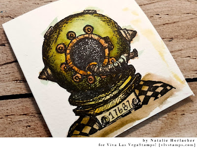
Next, I stamped my focal image - the whimsical diver - with Versafine Claire Ink and used watercolor brush pens to color it in. I used some brown and orange/gold tones first and went over parts of the image with a very light blue wash then. Doing this wash is easy: Instead of adding the color directly to the page, I scribbled some on my glass mat and picked it up with a water tank brush. The blue wash created this pretty greenish metal look.
I cut my image and inked up the edges with a black marker. Then I decided where to place it on my index card. For more interest in the background I added some messy stamping with the "into the abyss" text stamp. As I wanted a stonger impression as I had with my first layer, I used my juicy Versafine Claire ink pad again and made multiple stamp impressions without reinking the stamp very often. With this technique I did two areas around the diving helmet and one in the right top corner.
To finish my card, I did two more steps. First, I glues the image down together with some washi tape to avoid a weirdly floating focal point. Of course I could have simply glued the image to the bottom, but I just liked it to be a little higher.
Also, I collected some text fragments from books. I have a few old/used books (novels and poetry) that I just keep for this purpose. I went through them quickly (just a quick skimming) and through the snippets I already cut from some of the books and chose some fragments to form a new text. I love when you can see that the fragments are taken from different books, and to be honest, I love that it turned out a little oppressive.
So heres my finished index card again, as well as a few detail images:
Stamps used:
Steampunk Alphabet Unmounted (5888)
Whimsical Diver (19354)
Into The Abyss (19352)
Other material:
- index card
- Archival Ink (jet black)
- Versafine Claire Ink (nocturne)
- Lindy's Moonshadow Mist (buccaneer bay blue, moonlit mulberry)
- ZIG watercolor brush pens
- washi tape
- old books / text fragments
See you soon!


3 comments:
What a great post, Natalie! Sadly we're only on Day 10 of ICAD 2021 and I'm already a huge slacker. Maybe I'll catch up...maybe not. Either way, love your creation!
Thank you Julie ♡ I don't think you should be bothered by being behind. ICAD is not about feeling stressed, so just do what you can.
As usual I love your background!! Great ICAD!
Post a Comment