Showing posts with label Life Imitates Doodles. Show all posts

Tuesday, December 17, 2013

My Last Post in Abstract#VLVS #VivaLasVegaStamps #VLVS

Sandra here, with my last post as a member of the VLVS! Design Team.
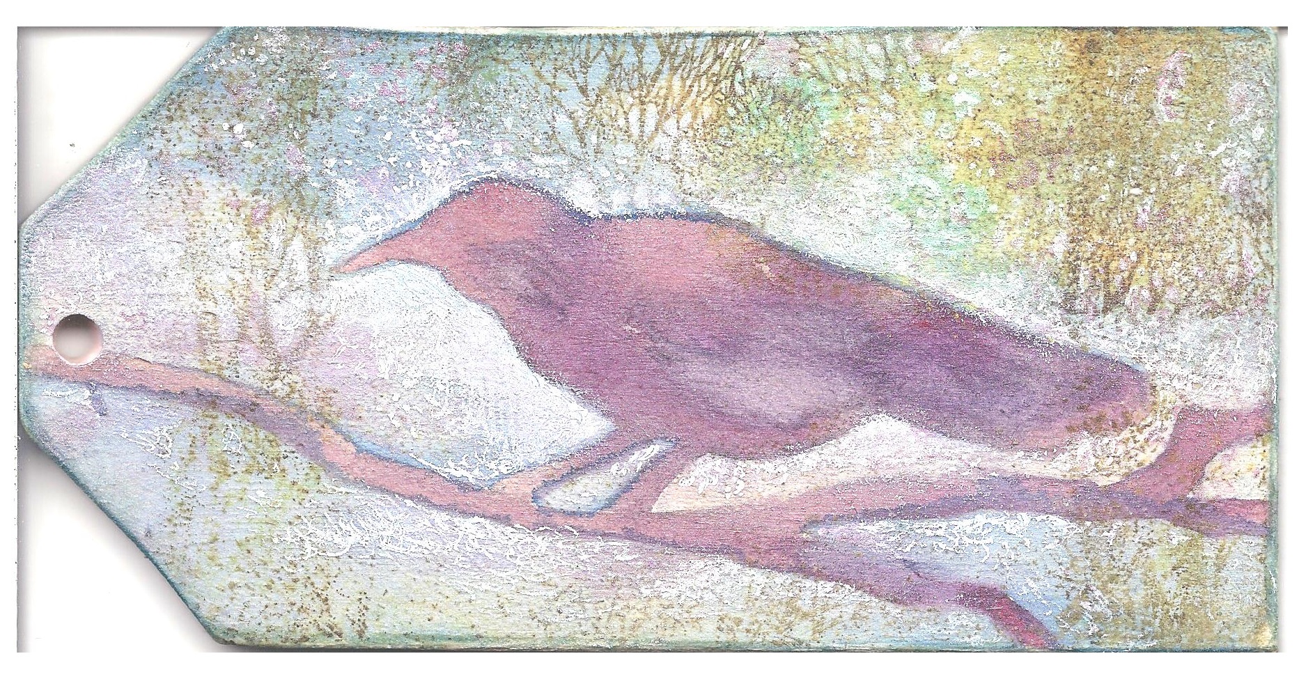
I decided it would be fitting to use a couple of the VLVS! stamps that are based off my artwork.


StazOn Jet Black Inkpad
Faber-Castell Gelatoes-Deep Red, Red, Dark Terracotta, Yellow Ochre, Pale Orange, Bright
Faber-Castell Stampers Big Brush Pen - Dark Sepia 175, Cold Grey 1 230, Ivory 103
Orange, Lemon Yellow, Cream
Stillman & Birn Zeta sketchbook
Hot Glue Gun & Glue Stick
Folk Art Metallic Peridot Fluid Acrylic Paint
Golden Iridescent Gold Fine Acrylic Paint
Transparent Gesso

Lately, I've been playing around with creation from destruction, taking artwork or practice work, destroying it by covering most of it up, and then creating something new.  My finished piece started out like this.  A practice chart I made in a sketchbook using Gelato water-soluble sticks, to see how the colors graduated.


To start the transformation, I used Stampers Big Brush pens to blend the stripes and add some grunge.  Stampers Big Brush pens are India Ink, not blenders, but the Ivory color is very light and the pens are wet enough to activate the water-soluble qualities of the gelatos, just enough for blending.


The third step was to stamp the images.  The joy of Zentangle-inspired stamps is that you can add a touch of Zentangle without drawing the tangles and then covering most of them up.  For that same reason, I didn't worry about getting a perfectly stamped image.  Zeta paper is good for stamping, but the curve of the book can get in the way.  No problem, in this case.


Recently, I've been playing around with glue guns, using the glue to create texture in a method I learned from Contadina K.  I melted glue sticks, covering most of the page with see-through strands.  I let it sit for about 1/2 hour and then coated it with a layer of transparent gesso.  I didn't completely cover the glue strands, so that any paint I added would have a slightly different appearance in some places.


After the gesso was dry (I let it sit for a day so both it and the glue would be fully cured), I used the same gelato colors as were used in the original stripes and rubbed the colors in at random, using my finger.  Then acrylic paints were added, the gold iridescent worked into some areas between the glue, and the metallic peridot was painted on top of the glue streaks.

It's difficult to show in a photo or scan, but the iridescent gold adds a sheen that changes in the light.  If you hold the page a certain way, the stamped zentangle images almost disappear.  If you tilt the book, you can see them almost completely.  Hints of the original striped colors show as well.


So long all! I hope you've enjoyed my last project for VLVS! I'll miss being part of the design team fun, but I hope I'll see most of you around on my blog, or Facebook, or Twitter.


Don't forget to check out the VLVS! November Challenge for a chance to win (plus it's fun!).

Thank you for stopping by, and I hope you've enjoyed your visit to Wonderland!For more of my work with Viva Las VegaStamps!, Amazing Mold Putty, zentangle-inspired art, and daily links to tangles, tutorials, and giveaways please visit my "Life Imitates Doodles" blog.   ~ Sandra Strait

Helpful Links: VLVS! Store for all your stamping needs; the  VLVS! Blog for new projects; VLVS! on  FaceBook,  Pinterest and Twitter

Tuesday, December 03, 2013

Christmas Card in Black #VLVS #VivaLasVegaStamps #VLVS #ChristmasCard

Black isn't a color you usually associate with the holidays but it works surprisingly well as a base when using metallic or glittery gel pens.


Supplies
VLVS! Stamps Used:

Sakura of America Gellyroll Pens
     Stardust: Red-Star, Lime-Star, Green-Star, Sky-Star, Golden-Star
     Metallic: Green, Gold, Blue, Red
     Standard: White
Tim Holtz Distress Markers: Barn Door, Peeled Paint


Elmer's Paint Pens: White, Black
Kromecote A2 Cardstock
Strathmore 140 lb cold-press watercolor paper 8 x 10
Golden Black Gesso
Miracle Tape
A finger or blending tool

Fold the sheet of watercolor paper in half so the more textured side is on the front.

Paint the front with black gesso, leaving a white border around it.  Don't worry about crisp  or even edges.


Stamp the Santa on a piece of Kromecote and color him with the Distress Markers.  
Place enough Miracle tape to cover the Santa.  Leave the strip on the back side of the tape for now.

Cut him out.

Remove the back strip from the Miracle Tape, and place the Santa so he is flush with the bottom of the card and outside the black area.

Add some blue metallic around the Santa and smudge it with your finger or blending tool (I really find the finger does a better job.  The oils I think).  Smudging must be done immediately while the ink is still wet.


Use the Gold Metallic pen to draw a border around the black, but keep a black border around the gold.

Continuing with the gold pen, outline a simple christmas tree, each section a triangular shape with three loops on the bottom.  Keep a line of black between each section.

Add the gold ornaments.  Simple again--just round and oval blobs.

Outline the packages, still using the gold pen..  Don't worry about perspective.  This is a primitive-style drawing so simplicity is what counts.  Make one large package next to Santa, and then draw 2 small packages behind him and the tree.  If you can fit another small one between the large package and tree do so, but don't sweat it.  

Fill in a stripe around the boxes for ribbon, and draw loops for the bow.

Color the area around tree, packages and Santa with the Red-star pen. Throughout, while you are coloring, leave a thick, black line between your color and the gold lines.  The black does not have to be an even thickness. It's more interesting if it isn't.

Use the red metallic to place stripes that run from the edge of the card toward the tree.  They won't show much, but will add a little depth.

Switch to the green metallic pen and color each section of the tree completely.

Switch to the Green-star pen and draw stripes from the bottom of each section to the top (same reason as with the red stripes)

Now switch to the lime-star and add similar stripes.

Switch to the Golden-star and make dots along the center stripes.

Use the blue metallic to draw the strings for the lights. Use the Red-star to color the lights (simple ovals), then use the Elmer's paint pen for white highlights.

For the rest of the black (except the border on the outside of the gold) color it with blue metallic.  Rather than making it solid blue, color a section about the size of your fingertip, and then smudge it as far as you can.  Keep doing this until the black is covered, but hints of it show through in places.

In the white border, on the left edge, color a dot of blue metallic about the twice the size of the pen's tip, and smear it in a fan shape.  Go down 1/2 and inch or so, and repeat this on the right edge.  Continue doing this around the entire border. Just skip over Santa and continue on the other side of him.

Use the black Elmer's painter pen to adjust your black lines.  If you have places without a black line around objects, add one.  If you have an area where it's just too, too uneven, even it out a bit (don't get to fussy about this.  It's a primitive-style, remember?).

In the white border, where you created the blue smudging, draw a line or two and smudge.

Finish by using the black Elmer's to thicken the Santa's outline on one side.


I hope you've enjoyed creating a Christmas Card in black!

Don't forget to check out the VLVS! November Challenge for a chance to win (plus it's fun!).

Thank you for stopping by, and I hope you've enjoyed your visit to Wonderland!For more of my work with Viva Las VegaStamps!, Amazing Mold Putty, zentangle-inspired art, and daily links to tangles, tutorials, and giveaways please visit my "Life Imitates Doodles" blog.   ~ Sandra Strait

Helpful Links: VLVS! Store for all your stamping needs; the  VLVS! Blog for new projects; VLVS! on  FaceBook,  Pinterest and Twitter

Tuesday, November 19, 2013

Alice in Wonderland Redux

'Alice in Wonderland' was one of my favorite books when I was young, and I count the original illustrator, Sir John Tenniel, as one of my artistic influences.  I thought I'd see if I could bring some new life to one of his drawings.


Supplies
VLVS! Stamps Used:
Alice With Caterpillar - Item 19300 Plate 941
Mushroom - Item 19118 Plate 923
Small Mushroom - Item 19121 Plate 923
Leafless Trees -  Item 15881 Plate 1260
Tall Tree - Item 14917 Plate 1210

7Dots Studio 'Love is in the Air' 6 x 6 Scrapbook Paper
Sakura of America Standard Gellyroll White pen; Stardust: Golden-star, Sky-Star, Green-Star, Copper-Star, Red-Star
Spectrum Noir Alcohol Markers-BT7, CG7, CT3, DG3, OR1, TB3
Ranger Archival Black ink pad
Distress Vintage Photo ink pad

I often find myself using products in the same way over and over, and it's a shame.  The phrase 'thinking outside the box' is a cliched saying, but only because it is true.  For the month of November, I was challenged to use 7Dots Studio scrapbook paper and Spectrum Noir alcohol markers and it suddenly occurred to me that I could use them together.

You don't generally think of using alcohol markers on colored paper and, truthfully, I don't know why not!  Most of the colors are translucent so you can't use them on black or dark colors, but why not lighter paperstock?

I started with a sheet of 6x6 scrapbook paper in bright yellows and oranges.  I laid out the VLVS! stamps I'd chosen until I was satisfied with the layout, and I stamped Alice and the Caterpillar, and the mushrooms in black.  The trees I stamped in brown, so there would be a feeling of distance.  (NOTE: It is important that you do NOT use StazOn ink for stamping when you will color with alcohol markers.  The solvent-based StazOn will react and smear.)


Even without color, the scene almost looks finished with the 7Dots Studio background!  

I chose my Spectrum Noir colors based not only on color, but on opacity.  Rule of thumber-darker colors tend to be opaque, not allowing the background to show through at all.  Lighter colors tend to be more translucent, letting some background show through.  There are exceptions so I do recommend testing first.  Your colors might look entirely different based on the background behind it.

I had a scrap of the same 7Dots Studio paper and I tested several colors on it.  Most collections do have more than sheet of the same color.  If you don't have a scrap, then do some abstract images--lots of circles or stripes, and use your test sheet for another project.


I used a mix of Citrus and Dull Greens in the foreground.  The Citrus allowed a little of the background color through, but the Dull Green didn't. I used Citrus in the midground.  Both True Blue and Turquoise Blue were used on Alice's dress and for a touch of shadowing on the mushrooms.  Orange was used to color the mushrooms and the Caterpillar.  I used True Blue to border the entire page, but left the background uncolored for a mottled yellow sky.  Citrus Green was used for the tree's foliage, and I added some Dull Green shadows in the midground.

The biggest issue with using colored paper now presented itself.  Everything was too dark.  I had expected this, and had my gellyrolls ready to go.  I used white for highlights, and to tone down the Caterpillar and mushrooms.  I used the green Stardust all over the grassy areas to tie everything together.  The yellow Stardust was used for Alice's hair, and the center grass of the midground. I blue Stardust was used to even out Alice's dress.  Alice's skin tones were created with copper Stardust overlaid with white.

As usual, it was difficult to get to get a scan or photo that shows the sparkle from the Stardust pens.  They added a glitter that made the scene other-wordly and defined the magic that is Wonderland!


I hoped you enjoyed my Adventure in Wonderland!  

Viva Las VegaStamps! is having a swap with 7Dots Studio for the whole month of November!   and don't forget to check out the VLVS! November Challenge for a chance to win (plus it's fun!).

Thank you for stopping by, and I hope you've enjoyed your visit to Wonderland!For more of my work with Viva Las VegaStamps!, Amazing Mold Putty, zentangle-inspired art, and daily links to tangles, tutorials, and giveaways please visit my "Life Imitates Doodles" blog.   ~ Sandra Strait

Helpful Links: VLVS! Store for all your stamping needs; the  VLVS! Blog for new projects; VLVS! on  FaceBook,  Pinterest and Twitter

Thursday, October 03, 2013

Autumn Gray--Keep the Blues Away

Sometimes, you just don't feel too creative.
Morning Bird
Here in the Pacific Northwest we get a certain kind of weather--it's wet, windy and gray, gray, gray.  Sort of a perpetual twilight that makes you want to dig into your cave and hibernate.  I'm certainly not the only one who is affected by it.  
Usually, you adjust after a few days, and most of us who live here come up with certain routines to get us through those first few days of funk. I know that a creative slump can be a problem for many, so for my design team post, I thought I'd share my routine  that I've come up with to keep me creating.
Pretty Pear
When the autumn twilight days hit, I know that ideas will be scarce.  I'll find it hard to decide what I want to do.  So I have a plan template.  It's simple, designed to help me make choices.
My plan template:
Use whatever compatible media is closest to hand.  I grab them in this order -- the closest paper or *substrate; a painting or coloring medium; remaining tools necessary for the project.
Flip through books or magazines and let one fall open at random.  Use something on the page for my subject matter.
Based on media being used, set a time limit for the piece to be done.
Choose a second project, using the steps above, so I can alternate between projects while items dry.
K.I.S.S. (keep it simple, stupid)
That's the plan.
(*substrate-any surface that is used for your art work.  It could be paper or wood or glass or fabric or anything you can draw, paint or glue on).
So, the closest substrate to where I was sitting was a wood tag. The closest drawing/coloring media were Daniel Smith watercolors.  The wood tag was already primed with Golden Acrylic Ground for Pastels.  If it hadn't been, I would have moved on to next medium closes to me--acrylic paints.  Watercolor on unprimed wood doesn't work so good.
I decided to do both sides of the tag, so first I flipped through a magazine.  There weren't any pictures, but I saw the word 'bird' and made it the subject for one side of the tag.  For the second side, I flipped through a book--Dory Kanter's 'Art Escapes', and landed on a painting of a pear.
The remaining tools needed were for applying the paint.  Brushes were closer than sponges or foam brushes, so I picked the first round that was small enough for the tag size, and cheap enough for using on wood.  I set up a container of water, and laid down a non-stick craft mat.
If I didn't have a purpose for this project, I would have stopped here--the fewer items used the better.  But this was stamping project so I needed more. I picked up the two stamps that were at the top of my stash--a Trees background and a Grunge writing background.  I chose a StazOn Jet black inkpad because it was the closest inkpad.  For the trees, I chose Shabby Shutters because trees are green, usually.  I also wanted to use my Sakura of America gellyroll pens.
I decided to give myself 15-20 minutes for painting the tags, and another 15-20 minutes to stamp and color.  
I drew the bird lightly on the wood, and traced it on the deli wrap.  I painted the bird and let it dry, while I switched to my alternate project.
When I came back to this project, I cut out the mask and set it on the on the bird, inked up the trees background with Shabby Shutters ink, and stamped the image on the wood. I didn't feel the contrast was strong enough, so I used a white gellyroll pen to add sky.  Then I added a touch of Rose-star Stardust pen to add the glow of sunrise and a little sparkle (which didn't show up well in the scan).
Then my time allotted came up, so I quit fiddling, and turned to the other side of the tag.
When the watercolor was thoroughly dry, I decided to experiment.   This wasn't part of the plan, but any stirring of creativity is welcome, so I went with it.  
I'd read a blog post recently where the author used transparent gesso to seal her art journal pages.  She explained in some detail how she carefully applied the gesso so it wouldn't cause water media to run.
Hmmmm.
Not sure if was because I was painting on wood, faulty application by a beginner, or just the technique itself--but I smeared my pear into mush!  I ended up lifting off most of the watercolor to save the piece..  It didn't look too bad--just like a very faded wood sign.    I stamped over the pear with the 1787 writing background, and upped the contrast with a dark green brush marker in the background.  I smeared color from a metallic gold gellyroll to punch up the pear, smearing a bit of the marker color for shading, and used a white gellyroll for highlights.  The last step was to add swirls with the gold gellyroll.  
My experiment added an extra 1/2 hour or so, but that's okay.  The time limit is set to keep me from fiddling in discontent, not to stifle experimentation.
So am I out of my creative slump?  Not really.  But I'm not worried.  I managed to finish three decent pieces (finished the alternate project too).   Even if they had been total fails, that would have been fine.  For me, the main thing is that instead of fretting that I couldn't create, I created.   There is a feeling of satisfaction that comes from that, and I know it will help me get out of my slump all the  sooner, better than ever and ready to roar.
Supplies
VLVS! stamps used:
Sakura of America Gellyroll pens -- Stardust: Golden-star, Rose-star/Metallic:Gold/Standard: White
StazOn JetBlack ink pad
Distress Shabby Shutters ink pad
Daniel Smith Watercolors: Phthalo Blue (red shade), Azo  Yellow, Quinacridone Magenta
Marvy Brush Marker-Posh Green
Golden Acrylic Ground for Pastels
Round watercolor brush
Water container
Deli paper for mask

Tuesday, August 27, 2013

Bees Singing in Lavender

This summer I went to a lavender farm.  
There were bees everywhere.  Their humming a song in the air.  Their energy--bursts of flight, wings sparkling with light.  
I wanted to capture some of that in a painting.


Supplies
VLVS Stamps Used:
Large Bee Item 19013 Plate 893

Small Bee Item 19012 Plate 893 

Bee/Small Item 1896 Plate 472

Genuinely Jane Studios Wood Book page (Picket Fence)
Cray-Pas® Specialist® Oil Pastels: Sakura Of America-Dioxane Violet, Mauve, Cobalt Blue, Titanium White/ Cray-Pas® Expressionist® - Sakura Of America: Purple, Yellow-Green, Yellow, White

Clairefontaine Rouge Mer 300 lb Cold Press Watercolor paper
Faber-Castell Gelatos:Tangerine, Mango, Butter Cream
StazOn Inkpad: Jet Black
Golden Fluid Acrylic paint: Micaceous Iron Oxide
Golden Soft Gel medium
Clay-shaping tool
Plastic eraser

I prepared my wooden panel by priming it with Micaceous Iron Oxide, an acrylic paint with particles that produce a dark surface with a fine tooth, and sparkle.  It's a good surface for pastels, and light on dark painting.


I blocked out the areas where I wanted lavender. Layering purples and blues, I moved and blended the color with a clay-shaping tool and a plastic eraser.   Long strokes of yellow and green were added for grass.  I made sure to leave areas of the Micaceous Iron Oxide showing for contrast.  I just kept layering the colors, blending and pulling out details with the shaper until I was happy.

In the upper right, where I used mostly yellows and whites, I ran the plastic eraser over the color, blurring most of the detail, and then, lightly, laid in long strokes of yellow and white to get a strong impression of sunlight.

I sprayed the complete piece with hair spray and let it set overnight (this sets it so you can layer on a medium without disturbing the pastel, but it isn't enough to be permanent on it's own).

The bee images were stamped onto the watercolor paper that I had colored in yellows and oranges using gelatos. I added strokes of yellow and white oil pastel.  I cut the images out, and folded the legs and wings downward to get some dimension.

To seal the piece, and to glue down the bees, I used soft gel medium, covering the bees completely on both sides, and layering it heavily on the oil pastel.

I couldn't catch it as well as I hoped, but the Micaceous Iron Oxide glitters in the light giving the impression of dust motes sparkling in the sun.


Thank you for stopping by, and I hope you've enjoyed my oil pastel painting.

There are still a few days left for you to enter the Viva Las VegaStamps! August challenge. It's great fun and a chance to share your projects with the world!


For more of my work with Viva Las VegaStamps!, Amazing Mold Putty, zentangle-inspired art, and daily links to tangles, tutorials, and giveaways please visit my "Life Imitates Doodles" blog.   ~ Sandra Strait

Helpful Links: VLVS! Store for all your stamping needs; the  VLVS! Blog for new projects; VLVS! on  FaceBook,  Pinterest and Twitter

Saturday, August 03, 2013

If Camels Had Wishes

If Camels Had Wishes...Everyone Would Ride Horses!


I really love this image of a camel's head  from Viva Las VegaStamps!  I've had it for the longest time, but I wasn't sure what he was doing.  Yodeling? Blowing bubbles?  And then I saw the Dandelion stamp and I realized he was making a wish!


Supplies:
VLVS! Images Used--
Camel Head Item 12753 Plate 1140
Camel Item 4995 Plate 493
Camel Running Right Item 1722 Plate 457
Camel Silhouette Item 1766 Plate 457
Blowing Dandelion and Extra Seed by Susan M. Brown Item 19045 Plate 918

Sakura of America Gellyroll-Gold Red Stardust
Faber-Castell ArtGrip Color Pencil-107, 125, 133
Distress Markers-Mustard Seed, Spiced Marmalade, Frayed Burlap, Antique Linen, Picket Fence, Crushed Olive, Walnut Stain
Distress Ink pad-Walnut Stain
Exacompta Journal Forum

The challenge with this project was the slope of the pages in the journal.  It's a thick one and impossible to lie completely flat.  I used unmounted stamps and didn't use a stamping block for the images that fell in the crease between the two pages, so the stamps were more flexible.  I practiced a bit on other pages, curving the stamps juuuust a little before touching the page.  White space was inevitable in the crease itself, but it wasn't much, and was easily filled in using the walnut stain marker that matches the inkpad.

I penciled in the words first to be sure they would fit, and then filled them in with Distress Marker.  I outlined them with Gellyroll pens.

Then it was just a matter of coloring the background with the Distress Markers.  I colored the dark areas first, stippling and making rough circles and dots for texture.  Then I used the lighter colors blending them into the darker.  I dotted the white Picket Fence to tone down some of the colors that I felt were too bright and to add more mottling in other areas.

Thank you for stopping by, and I hope you've enjoyed my art journaling page.

Have you entered Viva Las VegaStamps! August challenge? It's great fun and a chance to share your projects with the world!


Tuesday, July 16, 2013

Wanderlust

I have to admit I was never a wild child.  
I always envied those who were.


So I decided to celebrate the spirit of Wanderlust!

VLVS! Stamps used: 
Children Playing on Toy Car-19187 Plate 927
Wanderlust-19170 Plate 927

Sakura of America:
Cray-Pas® Expressionist® Oil Pastels-Red, Orange, Yellow, Pale Blue, Black, Yellow, Green
Gelly Roll® Stardust® Glitter Pens-Rose, Sky Blue, Gold, Red
Gelly Roll 1.0 Metallic: - Gold, Blue 

Other Supplies:
Heavy 5" x 5" Chipboard or Masonite tile
Silk Tissue Paper (aka very thin rice paper/mulberry paper.  White tissue paper would also work, but would harder to color)
Faber-Castell Stampers Big Brush pen-Ivory 103, Light Flesh 132
Miracle Tape
StazOn Inkpad-Jet Black
Hair Spray
Golden Regular Gel Medium
Golden Acrylic Ground
Plastic Eraser
Stylus
E6000 adhesive
Scissors
Bone Folder

The Tile-Using Cray-Pas® as Scratchboard (Sgraffito)


  1. Seal the tile with two coats of regular gel medium and 1 coat of Acrylic ground, letting each layer dry in between.
  2. Color the tile with the Cray-Pas®, adding each color at random applying the color heavily. DO NOT USE BLACK AT THIS TIME.
  3. Blend the colors together with the plastic eraser.
  4. Lay down a heavy coat of black, completely covering the other colors.  Don't worry--the other colors won't smudge.
  5. Use the stylus to carve designs into the oil pastel, allowing the first layer of colors to show through. 
  6. Spray with cheap hair spray and let set overnight to set color..
  7. Seal with regular gel medium. Let dry.
(NOTE:  Julie Fei-Fan Balzer has a video showing this technique )

The Chipboard Hexagon


  1. Seal the chipboard with two coats of regular gel medium and 1 coat of Acrylic ground, letting each layer dry in between.
  2. Lay down stripes of yellow-green Cray-Pas®, alternating with sky blue stripes.
  3. Spray with cheap hair spray and let set overnight to set color.
  4. Seal with regular gel medium. Let dry.
  5. Attach chipboard to tile with E6000.
The Stamped Images


  1. Stamp the ''Children Playing on Toy Car' and the 'Wanderlust images onto the silk tissue paper with StazOn ink.
  2. Cut around each image, leaving a generous border around each.
  3. Flip over and add layers of Miracle tape onto the paper to stiffen it. Leave the backing on the tape for now.
  4. Flip right side up, and color the children using the Gellyroll and Big Brush pens.
  5. Trim the Wanderlust image so it has a white border all around,
  6. Pull off backing and stick to the bottom corner of the tile.  Burnish with bone folder or spoon, taking care not to tear the tissue.
  7. Fussy cut the Children's image so no border is left.
  8. Pull off backing and stick to the bottom corner of the tile.  Burnish with bone folder or spoon, taking care not to tear the tissue.
Check out the VLVS! Store for all your stamping needs and the  VLVS! Blog for new projects. VLVS! FB - VLVS! Pinterest - VLVS! Twitter

For more of my work with Viva Las VegaStamps!, Amazing Mold Putty, zentangle-inspired art, and daily links to tangles, tutorials, and giveaways please visit my "Life Imitates Doodles" blog.   ~ Sandra Strait

Thursday, July 04, 2013

One of These Is Not Like the Others

Have you ever played those games where you have to pick out the object that is different than the other objects?


VLVS! Stamps used: 
Sitting Elephant - 19157
Whimsical Elephant - 19219
Whimsical Sheep - 18979

Sakura of America

  Gelly Roll Standard  -White,  

  Gelly Roll 1.0 Metallic: - Gold, Silver, Blue, Emerald and Purple

  Galaxy Gelly Roll Stardust Pens - Rose, Sky Blue, Lime Green, Purple, Gold, Red
   Pigma Micron Pen .08

Strathmore Toned Tan Art Journal

StazOn Inkpad - Jet Black
Pencil

This journal page was fun! The toned paper of the Strathmore journal makes everything POP, and gellyrolls are one of my favorite ways to color Zentangle-Inspired Art.

The steps are few:

  1. Stamp the elephants and sheep. I put the sheep in the middle...'cause its the 'Not Like the Other' one, if you hadn't guessed, lol!
  2. Write out the wording in pencil, to get the placement you want.
  3. Outline the words with the Micron pen.
  4. Draw strings (lines to create sections on the page).
  5. Fill the string sections with tangle patterns.
  6. Use the Gellyroll pens to color, color, color!
Some tips with using Gellyrolls:

Draw on some scrap paper to get your pen flowing well if you haven't used it in a while.  You'll see ink forming on the tip.

Make sure you've done most of your Micron Linework before using the Gellyrolls, or else wait until the gellyroll ink is completely dry before using Micron over it.  Otherwise, you risk clogging your Micron.

The slower you draw, the more even coverage you'll get.

The color that beads up on the tip is a mixed blessing.  It means you'll get a lovely flow, and fantastic coverage.  But that bead will dry, and then prevent flow.  So when you stop using the pen, wipe the tip.  If your flow gets thin, wipe the tip.  If you want a thinner line, wipe the tip before drawing it.

If you want to add a second layer of color, let the first layer dry or you'll just move the ink around.

If you want to lighten the intensity of the color, scribble a line or two and smear it with your finger (yep.  You'll get your fingers smudged).  You can also let the color dry and add white gellyroll pen over top.  Different effects, but both lighten.

You can find tangle patterns online.  Some of my favorite sites are Zentangle.com, Tanglepatterns.com and you can search for Tangle Patterns at my Life Imitates Doodles blog.

Check out the VLVS! Store for all your stamping needs and the  VLVS! Blog for new projects. VLVS! FB - VLVS! Pinterest - VLVS! Twitter

For more of my work with Viva Las VegaStamps!, Amazing Mold Putty, zentangle-inspired art, and daily links to tangles, tutorials, and giveaways please visit my "Life Imitates Doodles" blog.   ~ Sandra Strait

Wednesday, July 03, 2013

A Walk Down Memory Lane for the 4th of July

Have you ever come across something that brings back memories from your childhood?


For years my father had one of those free promotional calendars posted on his workshop cork board.  It was open to a 4th of July spread, and he never flipped the pages, presumably because he referenced the phone numbers or notes that had been scrawled on the page.  Or he just got so used to the calendar being there, he didn't even see it anymore.

When I found this fabulous Eagle and Flag stamp from Viva Las VegaStamps! I immediately flashed back to that calendar.  The details of the page were fuzzy, but the image of my father, standing in the garage, sorting his tools was very strong.  Dad's been gone some 30 years now, and I cherish every memory of him. I decided to recreate the calendar as closely as I could . 

VLVS! Stamps Used: 


Eagle And Flag


Other Supplies:
Kromecote A2 Cardstock
Miracle Tape
Molding Paste
Clairefontaine Cold Pressed 300 lb Watercolor Paper
Faber-Castell Gelatos-Red, White & Blue
Star-shaped Punchinella
StazOn Jet Black Inkpad
Distress Inkpads-Old Paper, Tea Dye
Marvy Brush Marker-Navy Blue
AD Marker Bleu Cobalt
Brush, water and Scissors
2B Pencil


I started by stamping my eagle image on Kromecote paper with StazOn and cutting it out, rounding off the corners.  I ran the Tea Dye distress pad over the surface to age it.

Setting the eagle aside, I  lightly traced the punchinella circles and measured off the stripes onto the watercolor paper.  I dipped my gelatos in water and painted the circles blue, and the alternate stripes in red.  I remembered those circles on that calender, but couldn't for the life of me remember what was in them.  I  finally decided to add stars.

I cut my circles from a strip of punchinella stars (you can buy it at Gauche Alchemy), and held each one down, firmly, with one hand while I used a finger from my other hand to cover the circle with molding paste.  I gave it a few seconds to set, just a little, and pulled the punchinella away.  I repeated this for each blue circle, and then did the same thing in random spots over the page.

Miracle tape was used to adhere the eagle to the page, and I used the Old Paper and Tea Dye around the edges of the watercolor paper to distress it.  Something still seemed missing, and I remembered there were lines of some kind on my calendar page.  I also needed something to tie the eagle into the layout, so I added the lines with Marvy and AD Marker.   I ran the Navy Blue marker around the edges as well and scribbled in some fake phone numbers (we were a Mohawk 5 phone number in those days), and a few notes in pencil.

Overall, I'm very happy with this piece--it brings back lovely memories each time I look at it.  The plan is to add matting, and a year-at-a-glance calender at the bottom.  Then I'll put it up in the garage, and I'll celebrate the 4th of July with my father for years to come.


For more of my work with Viva Las VegaStamps!, Amazing Mold Putty, zentangle-inspired art, and daily links to tangles, tutorials, and giveaways please visit my "Life Imitates Doodles" blog.   ~ Sandra Strait

.................................
__________________________________________
.................................

Check out the VLVS! Store for all your stamping needs and the  VLVS! Blog for new projects and news every day. Follow VLVS! as the VLVS! Forum - VLVS! FB - VLVS! Pinterest - VLVS! Twitter.

Tuesday, May 14, 2013

Sailing Away on Bleedthrumanade Seas

Sailing Away on Bleedthrumanade Seas


Front of journal page                                                           Back of journal page

Supplies:
VLVS! Stamps used:
Don't Follow You Dreams-Item 19003 Plate 893
Triple Mast Sailing Ship-Item 19026 Plate 890
Graphometre-Item 19017 Plate 890
Dictionary Page-Item 19015 Plate 890
Nautical Collage-Item 19016 Plate 890
Whitelines Hard Cover A5 Notebook (5.8 x 8.25)
StazOn-Jet black, Saddle Brown
Faber-Castell Stampers Big Brush Pen-White
White Gellyroll Pen
Bic Fine-line Alcohol Markers-Tranquil Teal, Hot Aqua, Lime Sorbet, Marquerita Green, Oceanview Blue, Blue Skies Blue, Polynesian Purple, Petal Pink, Pink Flamingo, Lemon Bliss, Yellow Blaze
Scrap of Silk Tissue Paper (mulberry paper)
Golden Soft Gel

Got Lemons? Make lemonade!  Got marker bleed-thru?  Make Bleedthrumanades!

For a long time, I avoided alcohol markers because the color bleeds through to the back of the page, unless you have really heavy or specially-coated paper.  The rare times that I used them, I avoided using the back of the page.

Then one day I had an epiphany (or something hit me in the head, more likely) and I thought, "Why not just use both sides of the paper?  The color will be the same but I can always do something different on both sides."  And thus, the bleedthrumanade was born, lol.  I get to use the scrumptious brilliant colors that alcohol markers have, provide myself with a challenge, and I only have to color once for two pieces!

I've had Plate 890 for a while, and I just love it, but I hadn't settled on a project to use it with yet.

Then recently, I was creating a bleedthrumanade in one of my notebooks (I usually color first before stamping or drawing).  When I finished, the colors looked rather map-like to me, and Plate 890 popped into my head.

The process went something like this:

I colored the front of the notebook page with the alcohol markers.

Except for the ship, I stamped the images, in brown, on both sides of the page.

I stamped the ship's image on the silk tissue paper, and decoupaged it to the front of the page.  When the gel medium was dry, I used a blue Bic marker to color around the ship.

The stamper's big brush pen was used to lighten the areas around the images and to cover up some of the bleed-thru from the brown ink (the stamper's big brush uses India Ink, which won't bleed-thru).  I decided I didn't want to change much about the back--I liked the way it looked.

With the white gel pen, I added a few highlights to the front and picked out smaller areas of the stamped image.  I didn't try to bring out the entire image on all of them.  I definitely left the graphometre looking like a watermark.

I had to laugh--while tangling, I noticed this strange blob, that made me think of an angel or soldier holding a spear, so I highlighted him a bit.  Do you think he's watching over the ship?


Staying with the white gel pen, I added a few Zentangle® -Inspired patterns around the edge of the page, and then decided to call it a day.

Are these pages done?  They feel done to me right now.  But bleedthrumanades are like most art journaling.  Some pages you keep coming back to and never finish, and others are done in one go.  It all depends on the mood of the day.

Check out the VLVS! Store for all your stamping needs and the  VLVS! Blog for new projects and news every day. Follow VLVS! as the VLVS! Forum - VLVS! FB - VLVS! Pinterest - VLVS! Twitter.